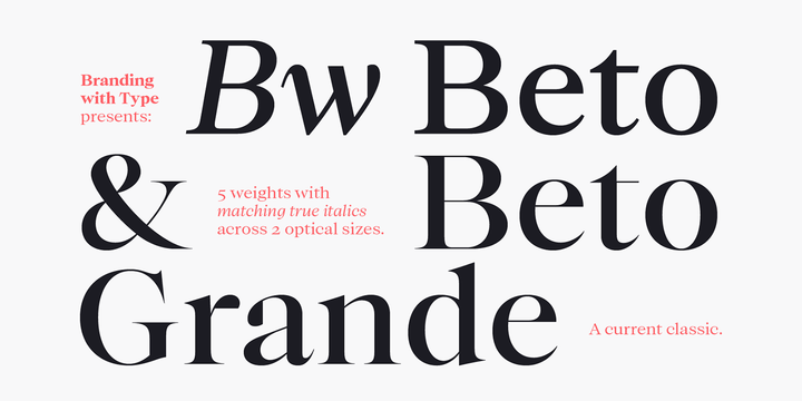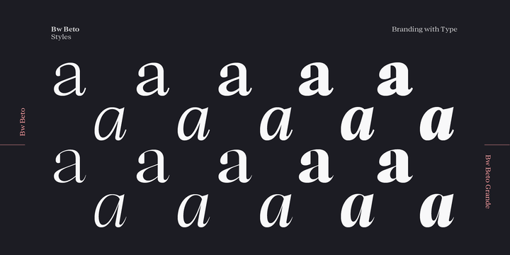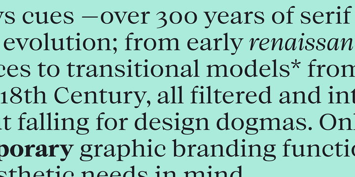
Designed by Alberto Romanos, Bw Beto borrows cues from over 300 years of serif design evolution; from early renaissance typefaces to transitional models from the 18th Century, all filtered and interpreted without falling for design dogmas. Only with contemporary graphic branding functional and aesthetic needs in mind. It’s available in 2 optical sizes containing 5 weights with matching true italics each.

